


Tuesday afternoon, three months back. That’s when AI data visualization tools stopped being a buzzword I skimmed past and became something sitting on my actual desk, waiting to be tested. I’d built dashboards the old way for years — dragging fields, arguing with dropdown menus, waiting on an analyst who had four other requests ahead of mine.
This felt different. You type a question in plain sentences, and a chart just… appears. Correct one, usually. I ran AI data visualization tools across three separate teams over these months, poked at what broke and what didn’t, and none of it matched the smooth marketing-deck version. It was rougher. Also better, in ways I didn’t expect going in.
What Are We Even Talking About Here
Strip away the buzzwords and it’s this: software that takes a messy spreadsheet and turns it into something visual, except now a machine learning layer is doing most of the labor for you.
Type “sales by region, Q2” and skip the manual chart-building entirely. The software just hands you the graph.
Some versions go further — they’ll tell you why a number looks off before you’ve even thought to ask. That part surprised me the most, if I’m honest.
Why Half My Colleagues Are Suddenly Obsessed

Data teams cared about this stuff first. Nobody else did. Then marketing wanted a chart by lunchtime and nobody had patience for a three-day turnaround anymore.
People who’ve never written SQL are pulling their own numbers now. That’s not a small shift — that changes who actually gets heard in a meeting.
One ops coordinator on a team I worked with caught a supply chain problem before her senior analyst had even opened his laptop that morning. She wasn’t trained in statistics. The tool just asked the right question on her behalf.
Dashboards Used To Just Sit There
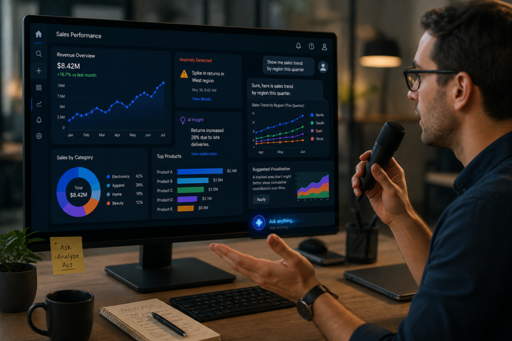
Old dashboards froze the moment you finished building them. Static. Somebody had to remember to refresh the thing manually, and usually nobody did.
AI-driven ones behave more like a coworker who won’t stop watching the numbers over your shoulder.
Anomalies get flagged before a human even opens the report some mornings. Chart types get suggested that you wouldn’t have picked yourself. Annoyingly? Sometimes correct.
Ask it something out loud, or type it — either way it feels less like “operating software” and more like negotiating with a very literal coworker who takes everything you say at face value.
Features Worth Your Actual Budget
Not everything labeled “AI-powered” on a pricing page earns that label. A short list genuinely does, though.
Natural language querying sits at the top. Typing a question, getting a usable chart back — that saves real hours across a busy week, no exaggeration.
Automated insight generation matters too. Patterns a tired analyst misses on a rushed Friday? The software catches those.
Predictive overlays are worth paying extra for if you’re forecasting demand or revenue. And smart alerting — the kind that pings you the second a metric drifts outside normal range — saved one team I worked with from a genuinely nasty end-of-quarter surprise.
Not All Of These Tools Solve The Same Problem
Lump them together and your buying decision goes sideways fast. They split into a few distinct lanes.
Enterprise BI platforms with AI bolted on. Established players, already trusted internally, now adding copilots and natural-language search on top of what teams already know.
AI-first startups, built from the ground up around conversation-style querying. Lighter. Faster to adopt. Occasionally shakier on governance and long-term data security — worth checking before you commit.
Embedded analytics tools, quietly living inside somebody else’s product so customers get charts without opening a separate app at all.
Spreadsheet-plus tools — AI bolted onto familiar spreadsheet logic. Easier internal sell, generally, for teams still nervous about “real” BI software.
The Broader AI-Tools Wave This Sits Inside
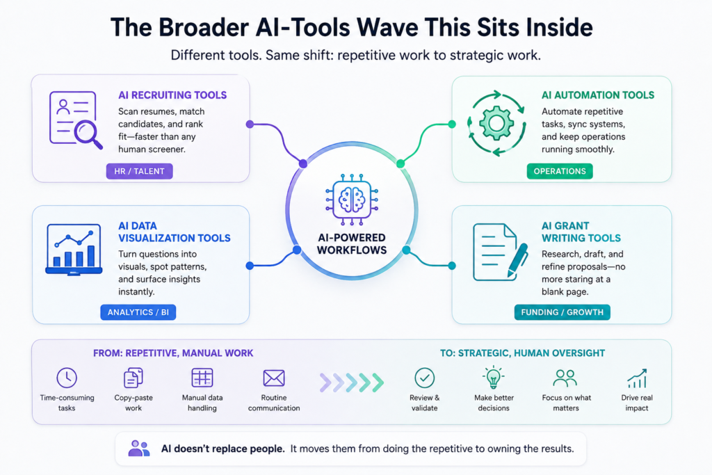
Visualization isn’t some isolated trend. Nearly every department is swapping manual work for AI-assisted work right now, quietly, one workflow at a time.
Hiring teams lean on AI recruiting tools to sort through resumes faster than any human screener manages on a Monday morning. Operations teams do something similar with AI automation tools, stitching together the repetitive tasks that used to swallow someone’s entire afternoon.
Even niche corners have caught up — teams chasing funding now reach for AI grant writing tools instead of staring at a blank page for an hour first.
Same pattern everywhere, visualization included: AI doesn’t remove the human. It just shoves them further upstream, from doing the repetitive work to double-checking it.
What The Actual Numbers Say
None of this is just a feeling I picked up scrolling LinkedIn. Analyst firms have receipts.
Gartner’s research puts a hard number on where this heads — by 2027, they project three-quarters of new analytics content will be shaped by generative AI, wired directly into business applications instead of sitting in a static report nobody reopens after Friday.
That’s not marginal. That’s a structural rewrite of how analytics teams operate within a handful of years, and most companies I’ve talked with aren’t close to ready for it.
Where It Still Falls Flat On Its Face
Won’t pretend this all works flawlessly. It doesn’t. Anyone claiming otherwise is selling something.
Ask a vague question, get a technically-correct-but-useless chart back. AI misreads ambiguity constantly — that hasn’t changed much despite the hype.
Trust is the bigger issue, honestly. Wrong insight gets auto-generated, and most business users won’t catch it. They’ll just believe the pretty chart sitting in front of them. In regulated industries, one bad number cascading into one bad decision isn’t a hypothetical.
Messy data doesn’t get cleaned by AI, either — it gets dressed up and presented more confidently. That’s arguably worse than an obviously bad chart.
How Vendors Are Racing To Fix The Trust Gap
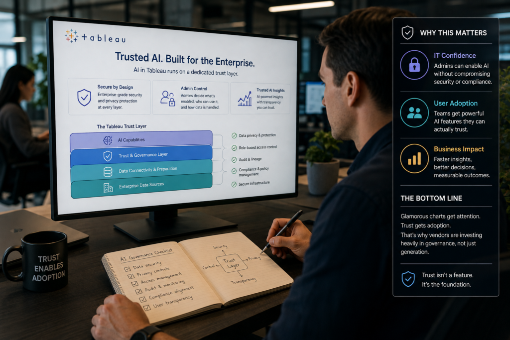
Money’s pouring into governance layers now, not just flashier charts, precisely because of that trust problem.
Tableau’s a useful case study. Their team has documented that AI in Tableau runs on a dedicated trust layer, built specifically so administrators can switch on AI features without gambling on data security or privacy across the org.
Unglamorous groundwork, that. But it’s usually the thing that decides whether IT actually signs off on the rollout.
Choosing Without Burning Six Months
Nobody says this part out loud enough: “best” depends entirely on who’s actually stuck using the thing every day.
Team already lives in spreadsheets? A spreadsheet-native AI tool gets adopted faster than any heavyweight enterprise platform nobody wants to sit through training for.
Governance non-negotiable — healthcare, finance, anything regulated? Lean toward the vendor with a documented security framework. Skip the flashiest startup demo from the conference floor.
Pilot it for real before signing. Five actual employees, real work, two weeks. Not a scripted vendor walkthrough where everything conveniently works. The gap between those two experiences is enormous, and you’ll feel it immediately.
The Money Talk Nobody Loves Having
Pricing swings wildly across this category, and vendors aren’t always upfront about where the real cost hides.
Per-seat here. Per-“AI-credit” there. Some bundle it quietly into a contract you’re already paying for, without mentioning the usage cap until you blow past it.
Ask directly what happens the moment usage spikes mid-quarter. That’s where the surprise invoice tends to live, and finance teams hate surprises more than almost anything else in this world.
Mistakes I’ve Watched Teams Make Repeatedly
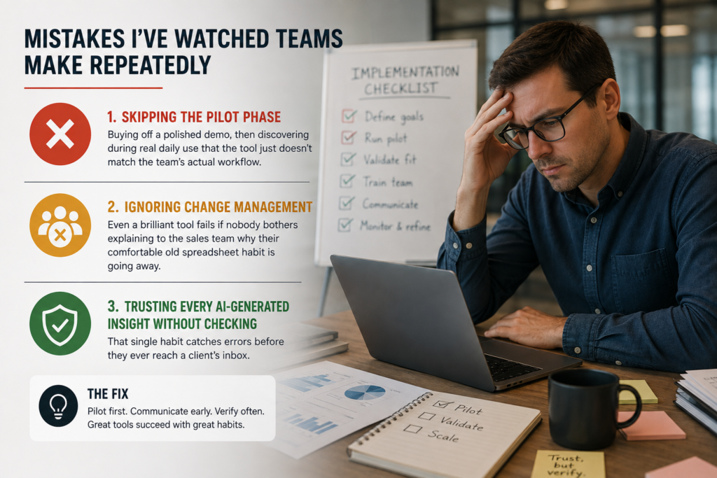
Same handful of mistakes, across wildly different industries, over and over.
Skipping the pilot phase tops the list — buying off a polished demo, then discovering during real daily use that the tool just doesn’t match the team’s actual workflow.
Ignoring change management comes next. Even a brilliant tool fails if nobody bothers explaining to the sales team why their comfortable old spreadsheet habit is going away.
And the sneaky one: trusting every AI-generated insight without spot-checking a sample against raw data first. That single habit catches errors before they ever reach a client’s inbox.
Where This Is Probably Going Next
Keep the current pace going, and these tools stop just visualizing numbers — they start acting on them directly.
Auto-generated reports triggering workflows on their own. Alerts opening support tickets without a human touching anything. Forecasts nudging budgets before a manager’s signature even enters the picture.
Exciting. Also a little unsettling, depending entirely on how comfortable you are handing a model decisions that used to require someone’s actual approval.
Frequently Asked Questions
Are AI data visualization tools worth it for small teams without a dedicated analyst?
Yes, often more so than for large teams. Smaller companies see the biggest time savings since these tools remove the need to hire a specialized dashboard builder early on, letting existing staff self-serve reports quickly.
Do AI data visualization tools replace the need for human data analysts?
Not really, not yet. They handle repetitive chart-building and pattern spotting fast, but interpreting business context, strategy, and nuance still needs a human behind the screen making the final call.
How accurate are the automated insights these tools generate?
Depends heavily on data quality going in. Clean, well-structured datasets produce reliable insights, while messy or incomplete data can lead the AI to confidently present conclusions that are simply wrong.
Can completely non-technical employees actually use these platforms well?
Absolutely — that’s the whole point of natural language querying. Someone with zero SQL background types a plain question and gets a usable, shareable chart back within seconds, no formal training required.
What’s the single biggest mistake companies make when adopting these tools?
Skipping a genuine pilot phase before buying. Companies often purchase based on a polished vendor demo alone, then discover during real daily use that the tool doesn’t match their actual workflow or data structure.
Conclusion
So, bottom line: AI data visualization tools aren’t a gimmick, and they’re not magic either. Somewhere honest in between those two extremes is where they actually sit. Time gets saved for people who used to wait days for a simple chart. Analytics opens up for folks who never learned a query language and never particularly wanted to. That part’s real — I watched it happen on teams that used to bottleneck every single report through one overworked analyst dreading Monday mornings.
Flip side deserves equal weight, though, not just a passing mention. These tools can be confidently wrong, and confident wrongness does more damage than an honest “I don’t know” ever could. A polished, professional-looking chart can still be built on a misread question, or on dirty data sitting quietly underneath it. Rolling this out across a team means building in some skepticism right alongside the new dashboard — skip that step, and an awkward meeting is probably waiting down the road.
If months of testing had to collapse into a single sentence of advice: treat these tools like a sharp junior analyst, not an infallible oracle running on a cloud server somewhere. Let it draft the first version of every chart. Let it flag anomalies that would’ve slipped past on a busy day. Keep a human checking the final numbers before they reach leadership, though — that judgment call still belongs to a person.
Pace of change here is fast. Vendors ship new features almost monthly, and what’s true about pricing or capability today might not hold by next quarter. Worth revisiting the choice every six months instead of locking in and forgetting about it entirely. That’s roughly where things stand right now: messy, promising, and worth a closer look if you haven’t taken one yet.

An IT career coach with 7 years of experience helping beginners map out certification paths that actually lead to interviews, not just another resume line. He’s guided dozens of career-switchers through their first AWS or CompTIA exam and writes for itechnova.io, covering IT certifications, cybersecurity, and the software tools people actually need to know.
1 thought on “AI Data Visualization Tools: A Proven, Shocking Guide For Every Analyst”